
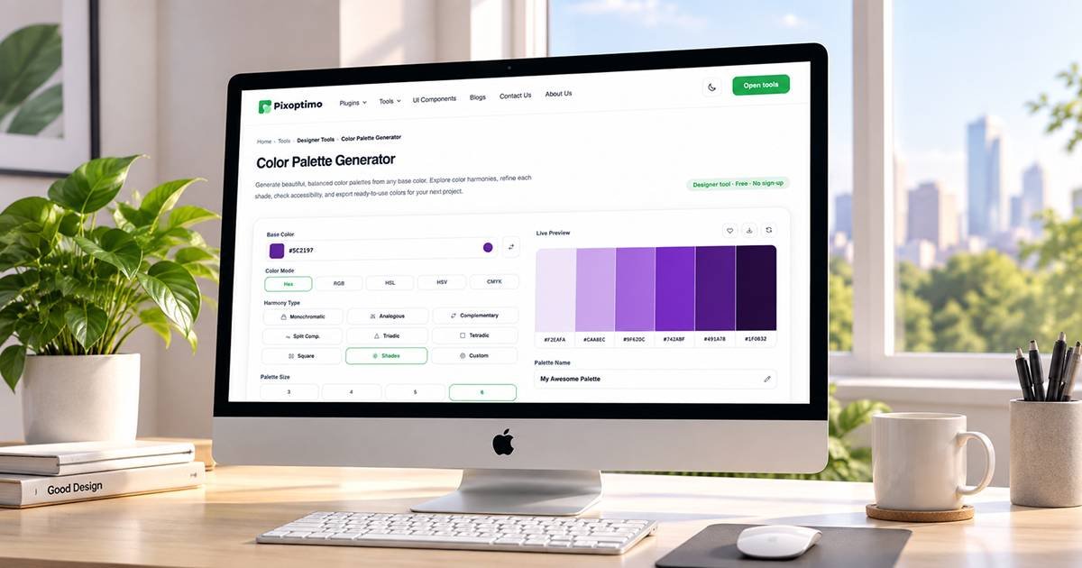
Choosing colors for a website or app can take longer than expected.
You might have one color that looks good, but finding two or three others that work with it is where things become difficult. A slightly wrong shade can affect contrast, hierarchy, buttons, backgrounds and even the overall mood of an interface.
A color palette generator can make that process much easier.
Instead of picking every color manually, you can start with a base color and explore combinations that follow established color relationships. You can then adjust individual colors, check contrast and export the finished palette for use in your project.
The Pixoptimo Color Palette Generator is built around this workflow, giving designers and developers a simple place to experiment with colors and prepare palettes for real projects.
What Is a Color Palette Generator?
A color palette generator is a tool that creates a group of colors that are designed to work together.
You normally begin with a base color. The generator can then create related shades or combinations using different harmony approaches, such as complementary, analogous, monochromatic, triadic or split-complementary relationships.
That gives you a starting point instead of a completely empty canvas.
You can still change the colors afterward. In fact, that is often the better approach. Color theory can suggest combinations, but the final palette should match the interface, brand and content you are designing.
A good generator should help you explore rather than force you into one answer.
Why Color Palettes Matter in UI Design
Color affects much more than appearance.
A primary color might be used for buttons and links. A lighter variation could become a background. A darker shade may work for headings or active states. Neutral colors provide space around those stronger tones.
When these relationships are planned together, an interface feels more consistent.
Without a palette, designers often end up choosing colors one screen at a time. That can create subtle differences between buttons, cards and backgrounds that become obvious once the product grows.
Starting with a defined palette gives the project a visual foundation.
How to Create a Color Palette With Pixoptimo
The Pixoptimo Color Palette Generator keeps the process straightforward.
1. Choose Your Base Color
Start with a color that represents the direction you want to explore.
You can work with common values such as HEX, RGB, HSL or HSV. If you already have a brand color, entering that value is an easy way to begin.
For example, a designer might start with the primary green used throughout a product and build the rest of the interface around it.
You can also use the color picker when you want to experiment visually.
2. Select a Color Harmony
Once you have a base color, choose the type of relationship you want to explore.
Depending on the project, you might try:
- Complementary for stronger contrast
- Analogous for colors that feel closer together
- Monochromatic for a more controlled visual system
- Triadic for a broader color relationship
- Split-complementary for contrast without using a direct opposite
There is no universally correct harmony.
A dashboard may need a restrained palette, while a creative landing page might benefit from more variation.
3. Generate the Palette
After selecting the harmony, generate your palette.
The tool calculates the related colors for you, giving you a set of starting points to work with.
This is useful when you know the general direction but do not want to manually calculate every variation.
More importantly, it makes experimentation faster.
You can try another harmony, compare the results and decide which direction fits the project.
4. Refine Individual Colors
Generated colors are not necessarily the final answer.
You can edit individual colors and adjust the palette as you go.
Maybe one shade is too bright for a background. Perhaps another needs to be darker for text. Or you may simply prefer a slightly warmer version of one color.
Being able to change individual values means you can move from a generated starting point to a palette that actually fits your design.
5. Check Contrast Before Using the Palette
A color combination can look attractive and still be difficult to read.
That becomes particularly important when choosing text and background colors.
The Pixoptimo generator includes contrast checking so you can review combinations before using them in an interface.
This is worth doing before a palette becomes part of a design system. Catching a weak text/background combination at this stage is much easier than discovering it after the interface has already been built.
More Than a Random Color Generator
There is a difference between generating random colors and building a useful palette.
Random generation can be fun for exploration, but it does not necessarily give you relationships that make sense for an interface.
A palette generator based on color relationships gives you a more deliberate starting point.
The Pixoptimo tool also lets you work with individual colors rather than treating the generated palette as something that cannot be changed.
You can explore different harmonies, refine colors, lock the ones you want to keep and continue experimenting with the rest.
That makes the process feel more like designing a palette than simply pressing a generate button.
Useful Features for Designers and Developers
The tool is particularly useful when you need to move between visual exploration and actual implementation.
You can:
Explore color harmonies
Try different relationships instead of manually guessing combinations.
Edit individual colors
Fine-tune shades when the generated result is close but not quite right.
Lock favorite colors
Keep a color you already like while experimenting with the rest of the palette.
Check contrast
Review whether selected combinations provide enough separation for readable interfaces.
Preview the palette
See how colors work together before committing them to a design.
Export the result
Use the generated palette in formats such as CSS variables, JSON or SVG, depending on your development workflow.
That last part is particularly useful when the palette needs to move from design into code.
A Practical Example
Imagine you are designing a productivity application.
You already have a green brand color.
Instead of manually selecting every supporting color, start with that green in the generator.
Try an analogous palette first. If it feels too similar, test a complementary or split-complementary relationship.
Once you find a direction you like, adjust the individual shades.
Then check the important combinations for contrast.
Finally, preview the palette and export the values for your project.
The whole process gives you a repeatable path from one starting color to a usable interface palette.
That is much easier to maintain than collecting colors randomly from different sources.
Color Palettes Should Support a Design System
A palette becomes more useful when it is connected to the rest of your design system.
For example, instead of thinking only in terms of individual hex values, you can assign roles:
- Primary
- Secondary
- Background
- Surface
- Text
- Border
- Success
- Warning
- Error
The exact structure will depend on the product.
The important part is that colors have a purpose.
This also makes future changes easier. If your brand color changes later, you can update the underlying system rather than searching through every screen for individual color values.
Why Use the Pixoptimo Color Palette Generator?
There are plenty of places online where you can generate random colors.
The useful part of the Pixoptimo approach is keeping the process focused on actual design work.
You can start with a known color, explore harmony relationships, refine the output, check contrast and prepare the result for development without constantly switching between different tools.
For designers, that means less time spent calculating or searching for combinations.
For developers, the export options make it easier to take the finished palette into a project.
And because the tool runs as part of the Pixoptimo tools collection, it fits into a broader workflow where practical design and development utilities are kept in one place.
When Should You Use a Color Palette Generator?
You do not need a generator every time you choose a color.
It becomes especially useful when:
- You are starting a new website.
- A product needs a fresh visual direction.
- You have a primary brand color but no supporting palette.
- You are creating a UI design system.
- You want to explore several color directions quickly.
- You need to check contrast before implementation.
- You want palette values ready for development.
It is also useful when you simply feel stuck.
Sometimes seeing several reasonable combinations is enough to move the design forward.
Frequently Asked Questions
What is the Pixoptimo Color Palette Generator?
It is a browser-based tool for creating color palettes from a starting color using different color harmony relationships. It also provides tools for editing, previewing, checking contrast and exporting palette values.
What color formats can I use?
The generator supports common color formats including HEX, RGB, HSL, HSV and OKLCH, giving designers and developers flexibility when working with different color workflows.
Can I create a palette from my brand color?
Yes. You can enter your existing brand color and use it as the starting point for exploring supporting colors and harmony combinations.
Can I change generated colors?
Yes. Generated colors can be edited individually, so you can refine the result instead of accepting the automatically generated values as final.
Can I check color contrast?
Yes. The tool includes contrast checking to help you review color combinations before using them in your interface.
Can I export the palette for development?
Yes. The generator supports exporting palette information in formats including CSS, JSON and SVG, making it easier to move the result into design and development workflows.
Final Thoughts
A good color palette should make design decisions easier, not create another problem to solve.
Starting with one color and building an entire interface around it manually can quickly become frustrating. A color palette generator gives you a useful starting point, while still leaving room for your own design judgment.
The Pixoptimo Color Palette Generator brings that process together: choose a base color, explore harmonies, refine the result, check contrast, preview the palette and export it when you are ready to use it.
Whether you are creating a website, dashboard, mobile app or design system, having a considered palette early in the process can save a lot of adjustments later.
Start with a color. Explore the possibilities. Build a palette that works for your design.