
AI design tools have become very good at producing something that looks finished.
That does not always mean they are useful.
For designers, the more interesting question is usually what happens before the final design: exploring an idea, testing a visual direction, explaining a product, turning a static chart into something understandable, or quickly making a motion concept that would normally take much longer to build.
That is where Anthropic’s latest Claude update gets interesting.
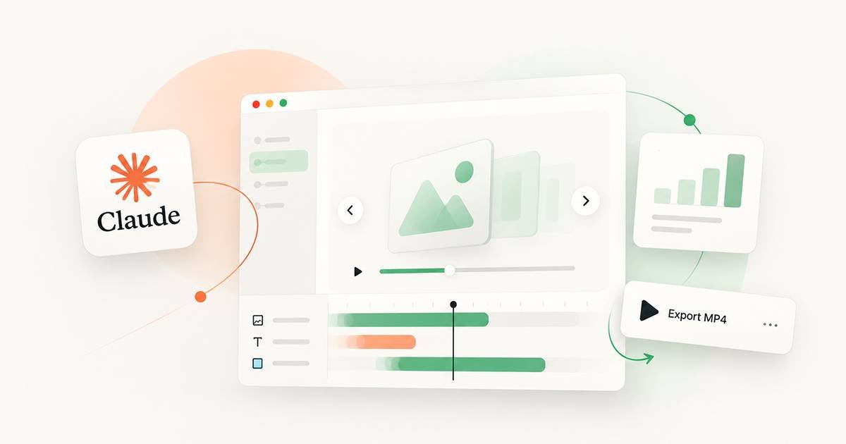
On October 8, 2026, Anthropic introduced Claude Dashboards and Claude Motion in beta. Dashboards can turn questions about connected business data into live dashboards, while Motion can turn ideas, reports, charts and product walkthroughs into editable animations that can be exported as video.
For designers, though, the headline is not simply “Claude can make animations.”
The more useful question is:
What can a designer actually do with it?
Quick Summary
- Claude Motion creates short, editable animations from prompts.
- The animation is built as code, rather than generated as conventional AI video footage.
- Designers can change text, numbers, timing and other visual elements.
- Animations can be exported as MP4 files.
- It can be useful for concept exploration, product explainers, presentations and motion references.
- Claude Dashboards is more relevant to data-heavy design and storytelling workflows.
- Neither tool removes the need for visual hierarchy, storytelling, interaction design or art direction.
- The biggest opportunity may be using Claude to create a first motion direction quickly, then refining it like any other design work.
Claude Motion Is Different From AI Video Generation
The first thing designers should understand is what Claude Motion actually is.
It is not simply a prompt-to-video system where you describe a scene and receive generated footage.
Anthropic says Claude Motion creates animations using code. It can animate text, charts, shapes and images, and those elements can then be edited. The resulting animation can also be exported as an MP4.
That distinction matters.
Imagine you are designing a product presentation and need a 20-second animation showing how three pricing plans differ.
With a traditional video-generation tool, you might generate a visual sequence and then struggle to make precise changes.
With a code-based animation, the underlying elements are much closer to design objects.
Change the number.
Change the timing.
Move the chart.
Rewrite the headline.
Adjust the sequence.
That makes the tool potentially more interesting for designers than a system that only produces attractive footage.
It is closer to rapid motion prototyping.
1. Turn Static Designs Into Motion Concepts
This is probably the easiest place for designers to experiment.
A static interface can explain what something looks like.
Motion can explain what happens.
For example, imagine you have designed a checkout experience with three important states:
Cart → Payment → Confirmation
You could use Claude Motion to create a short animation showing the transition between those states.
The goal does not have to be a production-ready animation.
Instead, it can answer a much earlier design question:
Would motion actually make this interaction clearer?
That is valuable because motion work can become expensive when it starts too late.
A designer may spend hours refining a static screen, only to discover that the intended interaction needs a completely different transition.
A quick animated prototype gives you something to react to before committing to the final direction.
2. Explain a Product Without Building a Full Video
Product designers regularly need to explain how a feature works.
The problem is that a product walkthrough can sit awkwardly between design and video production.
You need the UI.
You need the sequence.
You need transitions.
You need narration or captions.
You need editing.
Claude Motion could reduce the amount of work required to create the first version of that explanation.
Anthropic specifically describes use cases such as product walkthroughs for customer onboarding.
For a designer, that could mean turning a product flow into something like:
Problem → Feature → Interaction → Result
That structure works particularly well for SaaS products.
Instead of showing five screenshots on a presentation slide, you can demonstrate how the interface changes.
The important word here is first.
The AI-generated version should be treated as a starting point, not automatically as the final marketing video.
3. Make Presentations Less Static
A lot of business presentations still depend on static slides.
There is nothing inherently wrong with that.
But some information is easier to understand when it moves.
Consider a slide showing:
- 2024 revenue
- 2025 revenue
- 2026 revenue
- regional performance
- customer growth
A designer could turn the entire thing into a complicated infographic.
Or the information could appear progressively.
First, show the baseline.
Then introduce the growth.
Then highlight the strongest region.
Finally, reveal the conclusion.
That sequence creates a visual argument rather than simply displaying information.
Anthropic specifically positions Claude Motion for use cases such as animating charts in presentations and turning reports into short explainers.
For designers working on presentations, this could be one of the most practical applications.
4. Animate Charts Instead of Decorating Them
There is a difference between making a chart look better and helping someone understand it.
Designers often improve charts through typography, spacing, color and hierarchy.
Motion adds another layer: sequence.
Instead of displaying every data point simultaneously, an animation can guide attention.
For example:
Total users → growth rate → largest segment → important change
The viewer does not have to decode everything at once.
This is where Claude Dashboards also becomes relevant.
Anthropic says Claude Dashboards can connect to sources such as BigQuery, Databricks, Snowflake and Salesforce, generate dashboards from plain-language questions, and keep them current as the underlying data changes. Charts can also expose the query behind them and show when the data was last refreshed.
That creates an interesting workflow:
Data → dashboard → insight → animation → presentation
The designer’s role does not disappear.
It changes.
5. Create Motion References Before Production
This may actually be one of the smartest uses of the technology.
Designers do not always need a final animation.
Sometimes they need something they can show to another person and say:
“This is roughly what I mean.”
That is a very different problem.
A motion designer might spend time building a polished transition just to discover that the client imagined something completely different.
A quick AI-generated animation can serve as a visual reference.
It can communicate:
- timing
- sequence
- hierarchy
- movement
- emphasis
- transitions
- storytelling direction
The result can then be rebuilt properly in the team’s preferred motion tool.
In that workflow, Claude is not replacing the motion designer.
It is helping everyone see the idea earlier.
6. Explore Multiple Creative Directions Quickly
Good design often involves rejection.
The first idea is not always the best idea.
But exploring five motion directions manually can take considerably longer than exploring five static compositions.
This is where generative tools can have a practical advantage.
A designer could ask for different approaches to the same story:
Version A: minimal and editorial
Version B: energetic product marketing
Version C: data-focused
Version D: cinematic
The point is not to accept whatever Claude produces.
The point is to compare directions.
Which one has the clearest hierarchy?
Which one communicates the product fastest?
Which one feels appropriate for the brand?
Which one would still work without sound?
Those decisions remain design decisions.
7. Build Social Content From Existing Design Work
There is another obvious use case for teams producing social content.
A static product announcement can become a short animated post.
A feature card can become a motion sequence.
A chart can become a short educational clip.
A UI mockup can become a simple product walkthrough.
This matters because designers frequently have the visual assets already. The missing piece is often the motion layer.
Claude Motion is designed around animating existing text, charts, shapes and images rather than generating synthetic video footage.
That makes it a potentially useful bridge between design and content production.
The designer can still take the exported MP4 into a dedicated editor for the final polish.
What Claude Motion Probably Should Not Replace
This is where the hype needs some restraint.
An animation being technically editable does not automatically make it good.
Good motion design still depends on decisions about:
- pacing
- hierarchy
- rhythm
- composition
- typography
- accessibility
- brand language
- storytelling
- interaction context
Claude can create a starting point.
It does not magically know why a particular transition should happen at exactly 1.4 seconds.
It does not automatically understand the emotional character of your brand.
And it cannot replace a designer deciding whether motion improves the experience or simply adds noise.
That distinction will become increasingly important as AI-generated interfaces and animations become easier to produce.
The Best Workflow Is Probably Not “Prompt and Publish”
For professional designers, a better workflow looks more like this:
1. Start with the communication problem
Ask what the animation needs to explain.
Not:
“Make something cool.”
Instead:
“Show how this feature reduces three steps in the onboarding process.”
That gives the animation a job.
2. Create the first version quickly
Use Claude to explore the structure, sequence and movement.
Do not spend too much time trying to perfect the first result.
3. Review it like a designer
Look for problems.
Is the hierarchy clear?
Does the eye know where to look?
Is anything moving simply because it can?
Does the timing feel rushed?
Would the message work without the animation?
4. Refine the useful parts
Keep the ideas that work.
Remove everything else.
Change the typography, spacing, timing and visual language to match the actual product.
5. Finish in the right production tool
Anthropic says Claude Motion can hand work off to tools including Adobe, Descript, HeyGen, Higgsfield, InVideo, Luma AI and Runway, with Canva and Captions listed as coming soon.
That points toward a more realistic future for AI-assisted design:
AI for exploration.
Designer for direction.
Production tools for finishing.
What About Claude Dashboards?
Designers should not ignore the dashboard side of the announcement.
Claude Dashboards is aimed more directly at business data. It can create live dashboards from connected data sources using natural-language questions, while exposing the queries behind charts and showing data refresh information.
For product and UX designers, that could be useful during early exploration.
Instead of waiting for someone to prepare a dashboard, a designer might be able to ask questions about the data while working on a product concept.
For example:
Which onboarding step has the largest drop-off?
Or:
Compare signups this month with the previous three months.
Those answers could influence what deserves visual emphasis in the interface.
This is where the announcement becomes bigger than animation.
It points toward AI becoming more involved in the entire visual reasoning process, from raw information to presentation.
There Is Still a Human Advantage
The interesting thing about tools like Claude Motion is that they may actually make design judgment more valuable, not less.
When producing an animation takes hours, designers naturally become selective about what they make.
When producing ten rough directions takes minutes, selection becomes the harder problem.
Someone still has to ask:
Which version is worth keeping?
That requires taste.
It requires context.
It requires knowing the audience.
And it requires understanding when not to animate something.
Those are not small details.
They are the difference between generating content and designing communication.
Should Designers Start Using Claude Motion?
If your work involves presentations, product education, dashboards, SaaS interfaces, social content, UX concepts or data storytelling, it is worth experimenting with.
But I would not approach it as another “AI replaces your animation software” story.
That misses the more interesting opportunity.
Claude Motion could be useful because it makes early motion exploration cheaper.
A designer can take an idea that normally stays inside a Figma frame and give it movement.
A product team can see a walkthrough before committing to production.
A presentation can test whether animation improves the story.
A data team can turn an important finding into something easier to explain.
And a motion designer can start with a rough direction instead of a blank timeline.
That is a much more practical role for AI.
The Bigger Shift Is From Static Output to Visual Exploration
The most important part of Anthropic’s announcement may not be the ability to export an MP4.
It is the direction of the workflow.
Claude can now take information and help turn it into something visual, while the designer can inspect, edit and decide what happens next. Anthropic describes Motion as code-based and editable, while Dashboards exposes the queries behind visualized data.
That changes the relationship between AI and design.
Instead of asking AI for a finished picture, designers can increasingly use it as a visual thinking partner.
That is where the technology becomes genuinely useful.
The best result may not be the animation Claude creates.
It may be the idea that the animation helps you discover.
Final Take
Claude’s new animation capabilities are worth watching, but designers should resist judging them purely by how impressive the demo looks.
The practical value is elsewhere.
Use Claude Motion to explore motion.
Use it to explain.
Use it to prototype.
Use it to test a direction before investing in production.
Then bring human design judgment back into the process.
Because when AI makes creating the first version faster, the designer’s most important job becomes clearer:
knowing what deserves to become the final version.