
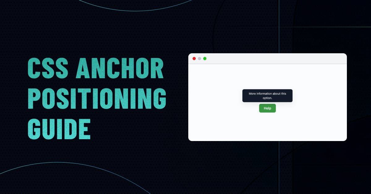
A tooltip should not be a difficult component.
You have a button. You have a small box of information. The box needs to stay near the button.
Simple.
Yet for years, that little relationship has often pushed frontend developers toward JavaScript. Once the page starts scrolling, the viewport changes, or the button gets close to an edge, positioning stops being just a couple of CSS properties. Something has to keep checking where the trigger is and decide where the floating element should go.
CSS Anchor Positioning gives the browser a better way to handle that relationship.
Instead of calculating coordinates yourself, you can tell CSS that one element is an anchor and another element should be positioned around it.
That sounds like a small addition to CSS. In practice, it changes how you can build a surprising number of interface components.
Tooltips are an obvious example. Dropdown menus, floating actions, badges, contextual controls, popovers, and validation messages can all benefit from the same idea.
And now that the core anchor-positioning features have reached broad availability in current browsers, it is worth learning rather than treating them as an experimental trick. MDN currently lists several core pieces, including position-anchor and position-area, as Baseline 2026.
Key Points
- CSS Anchor Positioning connects a floating element to another element in CSS.
anchor-namegives an element a name that other positioned elements can reference.position-anchorestablishes the default anchor relationship.position-areahandles common placements without manually calculating offsets.anchor()is useful when you need more exact control.- CSS can try alternative positions when a tooltip or menu runs out of room.
- Anchor Positioning handles where something goes, not whether or how it should open.
- Accessibility and interaction still need proper HTML and, where necessary, JavaScript.
- Browser support is now strong, but production code should still check the specific features it relies on.
The Old Problem With Floating UI
Think about a help icon beside a form field.
When someone focuses the icon, you want a small explanation to appear above it.
The first version is easy enough:
.tooltip {
  position: absolute;
  top: -40px;
  left: 0;
}
Then the real interface arrives.
The form moves.
The page becomes responsive.
The user scrolls.
The icon ends up close to the top of the viewport.
Now the tooltip is partly outside the screen.
You could add more CSS. Eventually, though, you start writing rules around a problem that is really about relationships, not fixed coordinates.
JavaScript libraries have traditionally handled this well. They can measure the trigger, inspect available space, and move the floating element when the layout changes.
That approach is still useful.
But if all you need is a component that stays attached to another element, having JavaScript constantly involved can feel like overkill.
CSS Anchor Positioning gives the browser that relationship directly. MDN describes the feature as a way to “tether” elements so the positioned element can follow changes in the anchor’s location and size.
Start With an Anchor
Let’s build the smallest useful example.
The button is going to be our anchor.
<button class="help-button">
  Help
</button>

<div class="tooltip">
  More information
</div>
Give the button an anchor name:
.help-button {
  anchor-name: --help-button;
}
The double hyphen is important. Anchor names use the same general dashed-identifier style you see in other CSS custom naming systems.
Now tell the tooltip which anchor it belongs to:
.tooltip {
  position: absolute;
  position-anchor: --help-button;
}
We have created the relationship.
But we have not actually told the tooltip where to sit yet.
That’s the next step.
Put the Tooltip Above the Button
For common placements, position-area is usually the easiest place to start.
.tooltip {
  position: absolute;
  position-anchor: --help-button;
  position-area: top;
}
That’s it.
The browser now places the tooltip in the area above the anchor.
position-area works from a 3×3 conceptual grid, with the anchor occupying the center. The surrounding areas give you straightforward placements such as top, bottom, left, and right.
You can be more specific too:
position-area: top center;Or:
position-area: bottom center;For a simple component, this is considerably easier to read than a collection of calculated top and left values.
Add the Gap Where You Actually Need It
The tooltip probably shouldn’t sit directly against the button.
Give it some breathing room:
.tooltip {
  position: absolute;
  position-anchor: --help-button;
  position-area: top;
  margin-bottom: 8px;
}
The important thing here is that the relationship hasn’t changed.
You haven’t calculated a new coordinate because the gap changed. You’re simply adding spacing to the positioned element.
That distinction becomes valuable when the component is reused in different layouts.
When anchor() Makes More Sense
position-area is convenient, but it isn’t the only way to work with an anchor.
Sometimes you want the positioned element to line up with a particular edge or point.
That’s where anchor() comes in.
For example:
.tooltip {
  position: absolute;
  position-anchor: --help-button;

  bottom: anchor(top);
  left: anchor(center);
  translate: -50% 0;
}
Here the bottom of the tooltip is tied to the top of the button, while the tooltip is centered horizontally around the button.
You can then introduce a gap:
bottom: calc(anchor(top) - 8px);This is where Anchor Positioning starts to feel different from ordinary absolute positioning.
Instead of asking:
“How many pixels from the containing block should this be?”
you’re asking:
“Which part of the other element should this edge follow?”
The anchor() function can reference sides or the center of the anchor and can be combined with CSS calculations.
Which One Should You Use?
For most everyday components, the decision is pretty simple.
Use position-area when the relationship is straightforward:
- Above the trigger
- Below the trigger
- To the left
- To the right
- In a simple area around the anchor
Use anchor() when you need more control:
- Aligning one edge with another
- Centering around a particular point
- Combining anchor measurements with
calc() - Building a custom offset relationship
Don’t reach for anchor() just because it looks more powerful.
A component that can be understood in five seconds is usually better than one that technically gives you more control but takes ten minutes to decipher.
The Interesting Part: What Happens at the Edge?
This is where floating UI usually gets annoying.
Imagine your tooltip normally appears above the button.
The button is near the top of the viewport.
There isn’t enough room.
A fixed-position tooltip doesn’t care. It can simply disappear beyond the edge.
Anchor Positioning has a mechanism for this.
You can provide another position for the browser to try.
For example:
.tooltip {
  position: absolute;
  position-anchor: --help-button;
  position-area: top;
  position-try-fallbacks: flip-block;
}
The preferred position is still above the button.
If that position causes the tooltip to overflow, the browser can try the opposite block direction.
In practical terms:
Top first → bottom if necessary.
That is one of the reasons Anchor Positioning is more interesting than simply replacing JavaScript with a few new CSS properties.
The browser can participate in the positioning decision.
MDN documents predefined fallback tactics as part of the Anchor Positioning module, including flipping an anchored element when its preferred placement would overflow.
You Can Define Your Own Fallback
Sometimes flipping the element isn’t enough.
Maybe your menu can appear:
- Below the trigger
- Above the trigger
- To the side
You can define a custom position with @position-try.
For example:
@position-try --above {
  position-area: top;
}

@position-try --side {
  position-area: right;
}

.menu {
  position: absolute;
  position-anchor: --menu-button;
  position-area: bottom;
  position-try-fallbacks: --above, --side;
}
The syntax gives the browser a preferred arrangement and additional options.
That can remove a surprisingly large amount of “if there isn’t enough room, move it here” logic from your JavaScript.
For more complicated components, you can also use anchored container queries to change styling when a particular fallback becomes active.
That could be useful for something like a tooltip arrow.
If the tooltip moves from above the button to below it, the arrow needs to move too.
The fallback isn’t just about location anymore. The component can react to the location it ended up using.
Dropdowns Are a Better Example Than Tooltips
Tooltips get most of the attention, but dropdowns show the practical value more clearly.
Suppose you have:
<button class="menu-button">
  Products
</button>

<nav class="dropdown">
  ...
</nav>
Make the button an anchor:
.menu-button {
  anchor-name: --products-menu;
}
Then attach the menu:
.dropdown {
  position: absolute;
  position-anchor: --products-menu;
  position-area: bottom;
}
If the menu needs to move when there isn’t enough space:
.dropdown {
  position-try-fallbacks: flip-block;
}
Now the component has a preferred relationship instead of a hard-coded vertical offset.
That’s particularly useful for reusable navigation components because the trigger can move without forcing you to recalculate the menu’s position.
Repeated Components Need One More Thing
Here’s a problem you may not notice in a tiny demo.
Suppose a page contains ten cards.
Every card has a button.
Every button has a tooltip.
If all ten buttons use:
anchor-name: --trigger;you need to be careful about which anchor a tooltip resolves to.
Without scoping, repeated anchor names can resolve to the last matching anchor in source order.
That obviously isn’t what you want.
anchor-scope exists for this situation.
A reusable component can scope its anchor name:
.card {
  anchor-scope: --trigger;
}

.card-button {
  anchor-name: --trigger;
}
Now the tooltip inside a card can resolve the anchor within the intended component boundary rather than accidentally attaching itself to another instance.
This is one of those details that doesn’t matter in a demo but matters a lot once you turn the demo into a design-system component. MDN specifically recommends anchor scoping for repeated components that reuse the same anchor name.
What About Popovers?
Anchor Positioning becomes even more useful when paired with the native Popover API.
The two features solve different problems.
Popover: handles the interaction and browser behavior around showing the popover.
Anchor Positioning: controls where the popover sits.
For example:
<button popovertarget="account-menu">
  Account
</button>

<div id="account-menu" popover>
  Account settings
</div>
You can then position the popover around its invoker:
#account-menu {
  margin: 0;
  inset: auto;
  position-area: bottom;
}
The reset of margin and inset is worth noticing. Native popovers come with default styles that can interfere with the positioning you are trying to establish. MDN calls this out in its Popover documentation.
This combination is a good example of where modern browser features start fitting together instead of acting like isolated CSS tricks.
Don’t Confuse Positioning With Interaction
There is an easy mistake to make here.
You build a beautiful tooltip with Anchor Positioning and assume the component is finished.
It isn’t.
CSS knows where the tooltip should go.
It doesn’t decide whether the tooltip should open on focus, hover, click, or some other interaction. It also doesn’t automatically create the semantic relationship a screen reader needs.
Those are separate concerns.
For a tooltip, consider things such as:
- Can a keyboard user reach the trigger?
- Is the information available on focus?
- Does the trigger have an appropriate accessible name?
- Is the relationship between the trigger and the information represented correctly?
- Can a user dismiss an interactive popup?
- Does the interaction make sense on touch devices?
And be careful with the word tooltip.
A small piece of non-interactive help text is one thing.
A panel containing buttons, links, forms, or settings is something else.
If users need to interact with the content, build an appropriate interactive pattern instead of disguising it as a tooltip.
A Useful Production Pattern
For a reusable component, I would separate the problem into four layers.
1. Structure
Write sensible HTML first.
Don’t make the component depend on CSS to communicate what it is.
2. Interaction
Decide how the component opens, closes, receives focus, and responds to the keyboard.
Use native browser features where they fit.
3. Positioning
Use Anchor Positioning to describe the relationship between the trigger and the floating content.
4. Fallback
Decide what should happen when the preferred position doesn’t fit.
This separation makes debugging easier too.
If the menu doesn’t open, that’s an interaction problem.
If it opens in the wrong place, that’s a positioning problem.
If it disappears off-screen, that’s a fallback problem.
You don’t need one giant JavaScript component responsible for all three.
A Complete Small Tooltip Example
Here’s a compact version you can experiment with:
<button class="info-button" aria-describedby="info-tip">
  ?
</button>

<div id="info-tip" class="tooltip">
  Your password must contain at least 12 characters.
</div>
.info-button {
anchor-name: --info-button;
}
.tooltip {
position: absolute;
position-anchor: --info-button;
position-area: top;
margin-bottom: 8px;
position-try-fallbacks: flip-block;
max-width: 240px;
padding: 8px 12px;
border-radius: 8px;
background: #111;
color: #fff;
}
@supports (anchor-name: --test) {
.tooltip {
/* Enhanced anchor positioning is available. */
}
}The example intentionally stays small.
There is no need to throw every Anchor Positioning feature into the first component you build.
Get the relationship working.
Then solve the actual problems your interface has.
Browser Support: What You Should Actually Check
This is one area where old tutorials can be misleading.
Anchor Positioning has moved considerably during 2026. MDN currently marks position-anchor as Baseline 2026 and position-area as Baseline 2026.
That is a strong signal for modern browser development.
But “Anchor Positioning support” isn’t a single checkbox.
The module contains multiple properties, functions, fallbacks, and related features. Some can reach broader support at different times.
So if your component depends on something specific, test that specific feature.
For example:
@supports (position-anchor: --test) {
  .tooltip {
    /* Anchor positioning version */
  }
}
Then give unsupported browsers a sensible fallback.
For a tooltip, the fallback doesn’t necessarily need to reproduce every positioning behavior perfectly.
A simple, usable version is often better than an elaborate compatibility system.
When JavaScript Still Makes Sense
This article isn’t an argument for deleting every positioning library from your project.
There are still situations where JavaScript is the right tool.
For example:
- Dragging interfaces
- Canvas applications
- Complex application-driven positioning
- Custom collision rules that depend on application state
- Components that need measurements unrelated to CSS layout
- Projects that must support browsers without the required CSS features
- Existing systems where replacing a mature positioning engine would create more risk than value
The question is not:
“Can CSS do this now?”
The better question is:
“Is the problem actually positioning, or is there application logic involved?”
If your JavaScript exists mainly because a dropdown needs to stay attached to its button, that’s a strong candidate for Anchor Positioning.
If your JavaScript is coordinating a complicated editor with multiple draggable objects and application state, CSS alone probably isn’t the right answer.
Why This Matters for Design Systems
There is a bigger reason to learn this feature.
Design systems are full of components that have relationships.
A tooltip belongs to a trigger.
A menu belongs to a button.
A badge belongs to a card.
A contextual panel belongs to a control.
Historically, we often expressed those relationships indirectly through coordinates.
Anchor Positioning lets CSS express more of the actual design intent.
That is useful for developers, but it is also interesting from a design-system perspective.
Instead of documenting:
“Set the menu to 44px from the top.”
you can build the component around:
“Place the menu below its trigger.”
The second rule survives changes in component size and layout much more naturally.
The Bottom Line
CSS Anchor Positioning is not a magic replacement for JavaScript.
It is something more useful than that.
It gives CSS a better vocabulary for describing how floating interface elements relate to the things they belong to.
Start with anchor-name.
Connect the positioned element with position-anchor.
Use position-area for ordinary placements.
Reach for anchor() when the alignment needs more precision.
Add fallback positions when the viewport gets in the way.
Then handle interaction and accessibility separately.
Once you approach it that way, tooltips stop being a “position this box somewhere near that button” problem.
They become what they really are:
two elements with a relationship.
And CSS can finally describe that relationship directly.
Frequently Asked Questions
What is CSS Anchor Positioning?
CSS Anchor Positioning is a set of CSS features that lets a positioned element use another element as an anchor. The positioned element can then follow the anchor’s location and size instead of relying on manually calculated coordinates.
Can I create a tooltip without JavaScript?
Yes, CSS can handle the positioning of a tooltip without JavaScript. The opening, closing, focus behavior, and accessibility requirements are separate concerns and may use HTML or JavaScript depending on the component.
What does anchor-name do?
anchor-name gives an element a name that can be referenced by an anchor-positioned element.
.trigger {
  anchor-name: --trigger;
}
What does position-anchor do?
position-anchor sets the default anchor used by a positioned element. It connects the positioned element to an anchor name declared with anchor-name.
What is position-area?
position-area places an anchor-positioned element in a region around its anchor using a 3×3 positioning grid. It is particularly convenient for common placements such as top, bottom, left, and right.
What is the difference between anchor() and position-area?
position-area is convenient when you want to place the element in a general region around the anchor. anchor() gives you more direct control over individual inset values, allowing you to align specific edges or points and combine them with calculations.
Can Anchor Positioning automatically move a tooltip when it reaches the edge?
Yes. Anchor Positioning includes fallback mechanisms that let the browser try alternative positions when the preferred position would overflow. position-try-fallbacks is used for these alternatives.
Does Anchor Positioning replace JavaScript?
Not completely. It can remove JavaScript from many positioning-only problems, but it does not replace application logic, interaction handling, or every advanced positioning scenario.
Is CSS Anchor Positioning ready for production?
The core feature has reached broad availability in modern browsers, with MDN marking key pieces such as position-anchor and position-area as Baseline 2026. However, check the exact features your component uses and provide a fallback when your browser-support requirements call for one.