
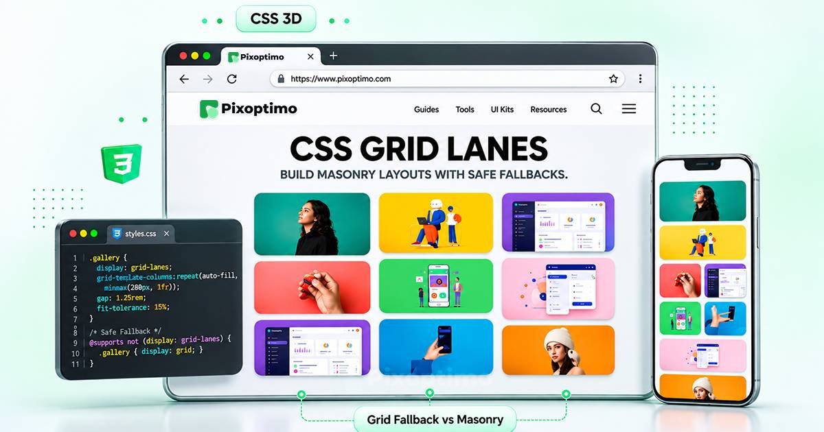
Creating a masonry layout on the web has traditionally required a compromise. Developers could use JavaScript libraries, CSS multi-column layouts or carefully constructed grid arrangements, but each approach came with limitations.
JavaScript solutions introduced additional layout logic. Multi-column layouts could produce unexpected reading sequences. Conventional CSS Grid required items to fit into defined rows, often leaving empty spaces beneath shorter cards.
CSS Grid Lanes introduces a native CSS layout mode designed to solve this problem.
With display: grid-lanes, the browser can place differently sized elements into columns or rows, packing content into the available space without requiring a JavaScript masonry library.
Safari 26.4 shipped support for the feature in March 2026. However, it is not yet universally available across browsers, so developers still need a fallback strategy.
There is another detail worth knowing before using it: Safari 27.2 renamed the flow-tolerance property to fit-tolerance. The older name remains available as a deprecated alias.
This guide explains how CSS Grid Lanes works, how to build column-based and row-based masonry layouts, how to control item placement, and how to use progressive enhancement for browsers without support.
Quick Summary
- CSS Grid Lanes is a native CSS layout mode for masonry-style layouts.
- Use
display: grid-lanesto activate the layout.grid-template-columnscreates a vertical waterfall layout.grid-template-rowscreates a horizontal brick layout.gap, track sizing and spanning properties provide control over spacing and placement.fit-tolerancecontrols how closely item placement follows the natural source sequence when lane sizes are nearly equal.- Safari 26.4 introduced support; Safari 27.2 renamed
flow-tolerancetofit-tolerance.- MDN still classifies Grid Lanes as experimental and of limited availability.
- Use
@supportsto provide a conventional CSS fallback.- Visual placement and keyboard navigation need to be considered together.
What Is CSS Grid Lanes?
CSS Grid Lanes is a layout system that extends the capabilities of CSS Grid.
It combines two layout behaviours:
- One axis uses a defined grid structure.
- The other axis uses a packing algorithm that places items into the lane with the most available space.
This produces a masonry-style arrangement without forcing every item to occupy an identical row height.
Imagine a gallery containing twelve images with different aspect ratios. In a conventional grid, the browser arranges them into rows. The tallest image can determine the space needed for its entire row, leaving unused space beneath shorter images.
Grid Lanes approaches the problem differently. Each image is placed into the column with the most available room.
<AsyncImageGroup query={[“CSS masonry waterfall layout gallery different height image cards”,”CSS grid lanes masonry layout columns visual demonstration”,”Pinterest style masonry photo gallery web layout”]} aspectRatio=”5:4″ layout=”carousel”/>
The result is a more tightly packed layout that adapts to the dimensions of its content.
This is useful for:
- Image galleries.
- Pinterest-style pinboards.
- Recipe collections.
- Editorial card layouts.
- Portfolio projects.
- Product discovery pages.
- Content feeds with varying card heights.
The important distinction is that Grid Lanes is not simply a CSS Grid property that fills empty spaces. It is a separate layout mode with its own placement algorithm.
CSS Grid vs CSS Grid Lanes
Both systems organize content into tracks, but they handle the stacking direction differently.
| Feature | CSS Grid | CSS Grid Lanes |
|---|---|---|
| Layout structure | Defined rows and columns | Defined tracks on one axis, packed lanes on the other |
| Item heights | Rows align to shared tracks | Items can have independent heights |
| Masonry effect | Requires workarounds | Native layout behaviour |
| Placement | Grid track placement | Automatic lane packing |
| JavaScript | Not required for ordinary grid | Not required for the native layout |
| Best use | Structured dashboards and layouts | Galleries and content with varying dimensions |
CSS Grid remains the better choice for layouts where precise row and column alignment matters.
Grid Lanes is more suitable when content has different dimensions and the design benefits from filling available space.
They solve related but different layout problems.
1. Create Your First CSS Grid Lanes Layout
The basic syntax is straightforward.
You need a container, the display: grid-lanes declaration and a track definition.
.masonry {
  display: grid-lanes;
  grid-template-columns: repeat(3, 1fr);
  gap: 1rem;
}
This creates three vertical lanes.
The browser places each child into the lane with the most available space, producing a waterfall layout.
Here is a simple HTML structure:
<div class="masonry">
  <article class="card">First item</article>
  <article class="card">Second item</article>
  <article class="card">Third item</article>
  <article class="card">Fourth item</article>
  <article class="card">Fifth item</article>
  <article class="card">Sixth item</article>
</div>
The browser handles the placement automatically.
You do not need to assign individual heights or manually position each card.
Use Responsive Column Sizing
A fixed three-column layout is not suitable for every screen width. You can use familiar CSS Grid track-sizing functions to create a responsive layout.
.masonry {
  display: grid-lanes;
  grid-template-columns:
    repeat(auto-fit, minmax(220px, 1fr));
  gap: 1rem;
}
This allows the browser to calculate how many columns fit within the available width.
For example:
- Wide desktop screens can display several columns.
- Tablets can display fewer columns.
- Narrow screens can fall back to a single column.
The minimum track size is important. Adjust 220px to match the content and available space rather than treating it as a universal value.
2. Build a Pinterest-Style Masonry Gallery
One of the most obvious uses for Grid Lanes is a gallery containing images with different aspect ratios.
The challenge with traditional CSS Grid is that items in the same row share the row’s track sizing. That can create empty areas when images have very different heights.
Grid Lanes allows each image card to contribute its own height.
<AsyncImageGroup query={[“minimal editorial masonry image gallery website varied portrait landscape photographs”,”Pinterest style masonry layout photography portfolio grid”,”modern masonry portfolio cards different image heights”]} aspectRatio=”5:4″ layout=”carousel”/>
Start with the HTML:
<section class="photo-gallery">
  <figure class="photo">
    <img src="photo-1.jpg" alt="Mountain landscape">
  </figure>

  <figure class="photo">
    <img src="photo-2.jpg" alt="Modern architecture">
  </figure>

  <figure class="photo">
    <img src="photo-3.jpg" alt="Coastal scenery">
  </figure>

  <figure class="photo">
    <img src="photo-4.jpg" alt="Abstract artwork">
  </figure>
</section>
Then apply the layout:
.photo-gallery {
  display: grid-lanes;
  grid-template-columns:
    repeat(auto-fill, minmax(200px, 1fr));
  gap: 1rem;
}

.photo {
  margin: 0;
}

.photo img {
  display: block;
  width: 100%;
  height: auto;
  border-radius: 12px;
}
The browser calculates the image dimensions and places the cards into the available lanes.
There is no need to assign a fixed height to every image. This preserves the original aspect ratios and avoids unnecessary cropping.
For production galleries, reserve image dimensions or use aspect-ratio where appropriate to reduce layout shifts while images load.
3. Build a Horizontal Brick Layout With Grid Lanes
Grid Lanes is not limited to vertical masonry.
You can reverse the layout direction by defining rows instead of columns.
.brick-layout {
  display: grid-lanes;
  grid-template-rows: repeat(3, 100px);
  gap: 1rem;
}
This creates three horizontal lanes.
Instead of placing items into columns based on available vertical space, the browser packs them across rows.
<AsyncImage query=”CSS masonry horizontal brick layout rows cards staggered layout diagram” aspectRatio=”16:9″ width=”100%”/>
The dimensions of individual items can vary along the inline axis.
For example:
.brick-layout .item:nth-child(1) {
  inline-size: 180px;
}

.brick-layout .item:nth-child(2) {
  inline-size: 260px;
}

.brick-layout .item:nth-child(3) {
  inline-size: 140px;
}
This is useful for horizontal timelines, visual navigation arrangements and layouts where content should flow from left to right.
Remember that the layout direction follows the writing mode. The examples here assume the usual horizontal writing mode used by English-language websites.
4. Control Masonry Spacing With Gap
Grid Lanes supports the familiar CSS gap property.
You can define one spacing value for both directions:
.masonry {
  gap: 1rem;
}
Or control the two axes separately:
.masonry {
  column-gap: 1.5rem;
  row-gap: 1rem;
}
The shorthand also works:
.masonry {
  gap: 1rem 1.5rem;
}
The first value controls the row gap, and the second controls the column gap.
For a gallery, larger column spacing can improve visual separation without introducing excessive vertical whitespace.
For a content-heavy card layout, consistent spacing helps users understand which elements belong together.
5. Use Grid Lanes With Different Track Sizes
Grid Lanes builds on CSS Grid’s track-sizing capabilities.
You can use fr, fixed lengths, percentages, auto, minmax() and repeat() to control the defined axis.
For example, this creates a layout where the middle lane receives twice the available width of the outer lanes:
.masonry {
  display: grid-lanes;
  grid-template-columns: 1fr 2fr 1fr;
  gap: 1rem;
}
You can also use a fixed-width sidebar and a flexible content area:
.masonry {
  display: grid-lanes;
  grid-template-columns: 220px 1fr;
  gap: 1.5rem;
}
This can be useful when creating editorial layouts with a consistent sidebar and a flowing main content area.
For more flexible track definitions, use minmax():
.masonry {
  display: grid-lanes;
  grid-template-columns:
    repeat(auto-fit, minmax(min(100%, 220px), 1fr));
}
This prevents the minimum track size from forcing overflow in particularly narrow containers.
6. Feature Cards Across Multiple Lanes
Sometimes one card needs more visual emphasis than the others.
A featured article, promotional card or highlighted portfolio project may need to occupy more than one track.
Grid Lanes supports spanning on the defined grid axis.
.masonry {
  display: grid-lanes;
  grid-template-columns: repeat(4, 1fr);
  gap: 1rem;
}

.featured {
  grid-column: span 2;
}
This makes the featured item span two columns.
You can also use explicit grid-line placement:
.featured {
  grid-column: 2 / 4;
}
However, explicit placement affects how the remaining items are packed. Use it carefully, especially when the layout is intended to follow a natural reading sequence.
7. Understand flow-tolerance and fit-tolerance
This is one of the most important details when building accessible Grid Lanes layouts.
The browser normally chooses the lane with the most available space. When two lanes have slightly different heights, even a very small difference can influence which lane receives the next item.
That can cause items to jump between columns.
For example, the visual sequence might look like this:
- Item 1 appears in the first column.
- Item 2 appears in the second column.
- Item 3 appears in the first column.
- Item 4 moves back to the second column.
- Item 5 returns to the first column.
The visual arrangement may look compact, but keyboard users watching focus move through the page can find the sequence less predictable.
The tolerance property helps control this behaviour.
What Does the Tolerance Property Do?
In Safari 26.4, the property was named flow-tolerance.
Safari 27.2 renamed it to fit-tolerance, following a CSS Working Group specification change. The older name continues to work as a deprecated alias in Safari 27.2.
The property establishes how much difference between lane positions can be treated as effectively equal.
When lanes are within the specified tolerance, the browser can prefer the natural flow order rather than constantly switching to the lane that is fractionally shorter.
A simple example:
.masonry {
  display: grid-lanes;
  grid-template-columns: repeat(3, 1fr);

  /* Safari 26.4 to 27.1 */
  flow-tolerance: 3lh;

  /* Safari 27.2 and newer */
  fit-tolerance: 3lh;
}
The two declarations are intentionally included.
Older Safari versions recognize flow-tolerance and ignore the newer property. Safari 27.2 recognizes fit-tolerance and continues accepting the old name as a deprecated alias.
The value 3lh is an example, not a universal recommendation. It represents three line-heights of tolerance.
How Should You Choose a Value?
The right value depends on the dimensions of your content.
- A smaller value allows more aggressive packing.
- A larger value makes the browser treat more lane-height differences as effectively equal.
- A value of
0removes the tolerance. - The default
normalbehaviour is equivalent to a tolerance of approximately1em.
A useful starting point for a content-card gallery is to experiment with 2lh or 3lh, then inspect the visual and keyboard sequence.
Do not assume that a higher value is automatically better. The aim is to find a reasonable balance between efficient packing and predictable navigation.
8. Reading Order, Keyboard Navigation and Accessibility
Masonry layouts introduce an important design challenge: the visual position of an item may not match its position in the HTML source.
Grid Lanes preserves DOM order. Screen readers and keyboard navigation follow the source sequence, even when the browser places items into different visual lanes.
That distinction matters.
Consider a gallery where the HTML order is:
1 → 2 → 3 → 4 → 5 → 6The visual layout might appear as:
Column 1     Column 2     Column 3

1            2            3
5            4            6
A keyboard user may move from item 3 to item 4 even though item 4 appears visually below item 2.
This does not automatically make the layout inaccessible, but it can create a confusing experience for sighted keyboard users who follow the focus indicator.
Keep the HTML Sequence Meaningful
Write your markup in the order that makes sense when read from beginning to end.
Do not use CSS placement to create an arbitrary visual sequence that contradicts the intended content order.
Use fit-tolerance Thoughtfully
The tolerance setting can reduce unnecessary lane switching when columns are nearly the same height.
Use the Grid Lanes Field Guide’s tab-order controls to inspect how different values affect the layout.
Avoid Unnecessary Explicit Placement
Spanning and explicit positioning can move items further away from their natural source position.
Use these features for deliberate visual emphasis, but consider their impact on the order in which people encounter the content.
Test With Keyboard Navigation
Use the Tab key to move through links, buttons and other interactive elements.
Check whether the focus indicator moves in a sequence that makes sense relative to the visual layout.
Also test with a screen reader. The source order remains important even when the visual arrangement changes.
9. Browser Support: Can You Use CSS Grid Lanes Today?
CSS Grid Lanes is available in Safari 26.4 and newer, but support is not universal.
MDN currently marks the feature as experimental and of limited availability because it is not supported in all widely used browsers.
The feature has also been available behind experimental flags in other browser implementations, but experimental support should not be treated as normal production availability.
<text color=”secondary” size=”xs” weight=”semibold”>SUPPORT SNAPSHOT — NOVEMBER 18, 2026</text>
| Browser / source | Status |
|---|---|
| Safari 26.4+ | Shipped support |
| Safari 27.2+ | Supports fit-tolerance; old name deprecated |
| Chrome / Edge | Check current stable support; experimental implementations are not equivalent to shipping support |
| Firefox | Check current stable support; older masonry experiments used different syntax |
| MDN Baseline | Not Baseline; limited availability |
Always check the live compatibility table before making Grid Lanes a requirement for a production application.
Use Progressive Enhancement
The safest strategy is to create a useful fallback first, then activate Grid Lanes when the browser supports it.
For example:
.gallery {
  display: grid;
  grid-template-columns:
    repeat(auto-fit, minmax(min(100%, 220px), 1fr));
  align-items: start;
  gap: 1rem;
}

@supports (display: grid-lanes) {
  .gallery {
    display: grid-lanes;
    grid-template-columns:
      repeat(auto-fit, minmax(min(100%, 220px), 1fr));

    flow-tolerance: 3lh;
    fit-tolerance: 3lh;
  }
}
The fallback uses a conventional CSS Grid layout. It may leave empty spaces beneath shorter cards, but it preserves a predictable row-based arrangement.
Supported browsers receive the masonry-style layout.
This is progressive enhancement: the page remains useful without the newer feature.
10. Working Demo: CSS Grid Lanes With a Fallback
The following example combines the techniques into one small gallery.
It includes:
- Responsive track sizing.
- Different card heights.
- Native Grid Lanes enhancement.
- A conventional CSS Grid fallback.
- Both tolerance property names for Safari compatibility.
- Semantic HTML.
You can save this as grid-lanes-demo.html and open it in a browser.
<!DOCTYPE html>
<html lang="en">
<head>
  <meta charset="UTF-8">
  <meta name="viewport" content="width=device-width, initial-scale=1">
  <title>CSS Grid Lanes Demo</title>

  <style>
    * {
      box-sizing: border-box;
    }

    body {
      margin: 0;
      padding: 2rem;
      font-family: system-ui, sans-serif;
      background: #f5f7f6;
      color: #17211b;
    }

    h1 {
      margin-bottom: 0.5rem;
    }

    .intro {
      margin-bottom: 2rem;
      color: #647067;
    }

    .gallery {
      display: grid;
      grid-template-columns:
        repeat(auto-fit, minmax(min(100%, 220px), 1fr));
      align-items: start;
      gap: 1rem;
    }

    .card {
      padding: 1.5rem;
      border-radius: 14px;
      background: white;
      border: 1px solid #dce5df;
      box-shadow: 0 4px 14px rgb(0 0 0 / 4%);
    }

    .card h2 {
      margin-top: 0;
      font-size: 1.1rem;
    }

    .card p {
      line-height: 1.6;
    }

    .card:nth-child(2) {
      min-height: 260px;
    }

    .card:nth-child(4) {
      min-height: 320px;
    }

    .card:nth-child(6) {
      min-height: 220px;
    }

    @supports (display: grid-lanes) {
      .gallery {
        display: grid-lanes;
        grid-template-columns:
          repeat(auto-fit, minmax(min(100%, 220px), 1fr));

        flow-tolerance: 3lh;
        fit-tolerance: 3lh;
      }
    }
  </style>
</head>

<body>

  <main>
    <h1>CSS Grid Lanes</h1>

    <p class="intro">
      A responsive masonry gallery with a
      conventional CSS Grid fallback.
    </p>

    <section class="gallery" aria-label="Design cards">

      <article class="card">
        <h2>01. Layout</h2>
        <p>
          Explore how modern CSS handles
          flexible content arrangements.
        </p>
      </article>

      <article class="card">
        <h2>02. Responsive Design</h2>
        <p>
          Build layouts that adapt to different
          screen sizes and content dimensions.
        </p>
      </article>

      <article class="card">
        <h2>03. Typography</h2>
        <p>
          Create clear visual hierarchies
          with readable text.
        </p>
      </article>

      <article class="card">
        <h2>04. CSS Architecture</h2>
        <p>
          Organise styles into reusable,
          maintainable components.
        </p>
      </article>

      <article class="card">
        <h2>05. Accessibility</h2>
        <p>
          Make interactive experiences
          easier to navigate and understand.
        </p>
      </article>

      <article class="card">
        <h2>06. Performance</h2>
        <p>
          Improve rendering and avoid
          unnecessary layout work.
        </p>
      </article>

    </section>
  </main>

</body>
</html>
In browsers without Grid Lanes support, the gallery remains a conventional responsive grid. In supported browsers, the feature query activates masonry-style placement.
The fallback is intentionally not a JavaScript masonry simulation. It is a simpler layout that preserves content order and remains useful.
11. Common CSS Grid Lanes Mistakes
Even though the basic syntax is short, a few implementation mistakes can affect the result.
Treating Grid Lanes as universally supported
Do not assume that every browser understands display: grid-lanes. Keep a working fallback.
Using the old tolerance property without checking the rename
Safari 27.2 uses fit-tolerance as the current property name. Include the older flow-tolerance declaration only when supporting earlier Safari versions.
Trying to force every item into a fixed height
The advantage of masonry is that content can retain its natural dimensions. Avoid unnecessary fixed heights that defeat the purpose of the layout.
Ignoring keyboard navigation
A compact visual arrangement can still be confusing when focus jumps between distant visual positions. Test the actual tab sequence.
Using it for every grid
A dashboard with aligned metrics or a comparison table generally needs conventional Grid rather than masonry packing.
Assuming a fallback must look identical
A fallback does not need to reproduce every visual detail. It needs to preserve the content, remain usable and communicate the same information.
Final Thoughts
CSS Grid Lanes gives developers a native way to create masonry-style layouts without relying on JavaScript libraries or layout workarounds.
Its support for both column-based waterfall layouts and row-based brick arrangements makes it more flexible than a feature designed only for image galleries.
The most important part of using it in production is not the initial display declaration. It is understanding how the browser places content, how tolerance affects the sequence, and how to preserve a usable experience in browsers that do not yet support the feature.
Start with a conventional CSS Grid fallback. Add Grid Lanes through @supports, experiment with fit-tolerance, and test keyboard navigation with your actual content.
That approach gives you the benefits of a newer CSS layout system without making your website dependent on experimental browser support.